Monday, 2 December 2013

Drafting and planning double page spread

I have made this double page spread with a person called Olesya Rulin who i would like the style of my model for my magazine to look like. She suits the pop indie style i am aiming for. The two other double page spread images i have posted have influenced me into doing the layout like this with the big letter and the image on the one side of the page. This suits my theme as a pop theme for my magazine and would look right in the Billboard magazine.

I am sure i want the one letter on the right hand side in big with columns. Its easy for you to read if it is in columns than rather all over the place. I think the colour of the letter depends on the theme as i have used grey now as it goes with the photo.


Thursday, 28 November 2013

Drafting and planning a magazine


In response to my research on magazine covers trying to find ideas for my own and the layout of what i want mine to be. I made a magazine cover similar to the photo i found of Barbara Palvin and the Rolling Stones magazine with Rihanna on.

They are both similar because the pose they are doing is to the one side and as i said i like all the cover stories on one side of the magazine i have done this.

The way i have used all female artists shows that the audience is aimed at females.
The way that all the stuff on the left makes it clear for people to see on the shelves. Also the model Shannon is looking straight into the camera showing direct address.
I would like to do something like this however have some cover times and not just names on the side. I would want to use a quote on the front which would then get to a bigger one on the double page spread.

Another response it is to is my research task of Selena Gomez. I have tried to make it like hers as i do like it,

I like the way i have done this magazine however I do not know if its what i would want to do in my final. I think with all the other magazines i have researched they all have a theme on the front cover and with the magazine that is very simple and doesn't have a lot of colouring.

I like how this magazine looks and follows how 'Billboard' magazines are. It shows how that is the magazine that has influenced me.

Thursday, 21 November 2013

Double page spread research

I really like the style of this two page spread page, it is like the other two i like and has used a simple black and white colour to make all the things stand out. The way she is wearing red makes her stand more out making her look important and draws all the attention towards her. The clothes she is wearing are normal and nothing special like some of the celebs that get dressed up. This fits in with the main head line as the way it is layered out looking like its been cut up shows the normality of the star also. I would like to use a quote in my double page spread as i think it looks effective and makes the reader feel engaged more because they then know what what they are reading isn't lies. I like the columns as they are easy to  
read - most magazines to this to keep it simple which i would also like to do.

I think with my magazine I want my model to wear normal clothes and not any fancy ones. It will fit with who she is. 

Friday, 8 November 2013

research into magazine / similar products


I like the style of this magazine where Rihanna is on one side and all the cover lines are to the one side of the magazine. This makes the cover look more organised and easy for the audience to read. Its simple but effective and has inspired me to do something like that for my magazine.

This image of the model Barbara Palvin has also had an effect on me and can fit in with the magazine like Rihanna with her pose.  If i did the style of what Barbara Palvin is doing i would be able to put all the cover lines down the right hand side. This has made me want to do something like that. I has encouraged me more to go along with my decision and not have a band/ a boy but use a girl artist for my front cover.
They both have the pop style look which will go well with my billboard type magazine.
The one on the left - Barbara really suits a pop indie look.

The poses are just like the one I liked in my research task with Selena Gomez. I am going to take a photo like these and make a magazine draft to see if i like it and would want to follow on doing it.


Double page spread research


I really like this double page spread layout, the way the one whole side is the photo of the star who is Lana Del Rey shows how important she is. The way the text is put  in columns makes it easy to understand so you don't have any difficulty. It is very simple but effective and the big S makes. Recently i have posted a double spread page of Katy Perry with there being a bold letter in the background also - I really like these type of cover pages and would like to do it in my magazine.

I like the camera work of the image, its dark making it look mysterious with a red streak running through her hair. This is the only bold colour used suggesting things like love, passion and lust. The way the camera techniques used circles almost made it look like they are stars, that is what you think about seeing them showing how shes a star.

I like the way the image is unusual and Lana Del Rey is not looking at the camera but has her eyes closed, this is not normal for magazines to do this as it goes against the usual conventions of a magazine layout.

Wednesday, 6 November 2013

Remake / remodel task

My magazine choice was Q magazine so therefore the cover image and story I have used which is the pop star Lilly Allen fits in with the ethos. I'm sure of this because researching the other Q magazines Lilly Allen was the main image for one.
The way i have made the ' Free posters inside' at the top makes it appeal more to people as you can see it straight away as it is blending in with the title and is the most brightest colour on there.

The colours all go well together because the box backing the cover line and the cover line down the bottom are the same colour, making the colours match makes the magazine look more professional. Having black and white as the title just makes it more simple not taking any of the attention off the main star.

I have not left many negative space on my magazine just enough to see the background of the image. With this picture - seeing the background of the picture makes it more effective as it makes the cover star seem more casual which goes with the style of the image with her looking down.

It is essential that you have the price and date line of the magazine and making them black with plain writing does not take any attention off any of the cover lines getting them mistaken so having them at the right size is important.
Using the model and Lilly Allen shows how the target audience is aimed at more females than male. 


Thursday, 24 October 2013

Double page spread analysis

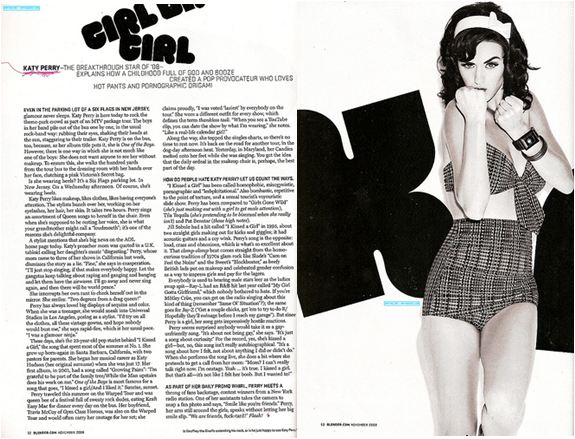
In this double page spread Katy Perry is the main image, mise-en-scene is used as the whole theme of it is black and white making it look original, simple and vintage.  Having it in black and white also makes it look professional as so does the columns makes it look professional also.The clothes that she is wearing relates to this as well as they are vintage and appeals to the audience. The lighting in the image is very bright enhancing the star. The main star is very big and takes up half the page showing how important she is.

The main title is bubbly and round which suggests that it may appeal to females more than males as it would be more bold if it was. The darkness of the colour contrasts with the white background making it stand out more. It emphasises it and makes it stand out so you know that it is the main title.  Straight away in the sub heading you know who it is about with Katy Perry in bold, using the word 'Hot pants' links with the image as that is what she is wearing.

I would like to do something like this in my magazine as she does relate to the genre i want to do which is pop and is quite girly. I like the colours used as they are professional and make it look better. Its makes the star look more important and the way she is standing looking at the camera shows the direct address that she wants between the audience and her making you feel like you have an insight to her life.