Friday, 8 November 2013

research into magazine / similar products


I like the style of this magazine where Rihanna is on one side and all the cover lines are to the one side of the magazine. This makes the cover look more organised and easy for the audience to read. Its simple but effective and has inspired me to do something like that for my magazine.

This image of the model Barbara Palvin has also had an effect on me and can fit in with the magazine like Rihanna with her pose.  If i did the style of what Barbara Palvin is doing i would be able to put all the cover lines down the right hand side. This has made me want to do something like that. I has encouraged me more to go along with my decision and not have a band/ a boy but use a girl artist for my front cover.
They both have the pop style look which will go well with my billboard type magazine.
The one on the left - Barbara really suits a pop indie look.

The poses are just like the one I liked in my research task with Selena Gomez. I am going to take a photo like these and make a magazine draft to see if i like it and would want to follow on doing it.


Double page spread research


I really like this double page spread layout, the way the one whole side is the photo of the star who is Lana Del Rey shows how important she is. The way the text is put  in columns makes it easy to understand so you don't have any difficulty. It is very simple but effective and the big S makes. Recently i have posted a double spread page of Katy Perry with there being a bold letter in the background also - I really like these type of cover pages and would like to do it in my magazine.

I like the camera work of the image, its dark making it look mysterious with a red streak running through her hair. This is the only bold colour used suggesting things like love, passion and lust. The way the camera techniques used circles almost made it look like they are stars, that is what you think about seeing them showing how shes a star.

I like the way the image is unusual and Lana Del Rey is not looking at the camera but has her eyes closed, this is not normal for magazines to do this as it goes against the usual conventions of a magazine layout.

Wednesday, 6 November 2013

Remake / remodel task

My magazine choice was Q magazine so therefore the cover image and story I have used which is the pop star Lilly Allen fits in with the ethos. I'm sure of this because researching the other Q magazines Lilly Allen was the main image for one.
The way i have made the ' Free posters inside' at the top makes it appeal more to people as you can see it straight away as it is blending in with the title and is the most brightest colour on there.

The colours all go well together because the box backing the cover line and the cover line down the bottom are the same colour, making the colours match makes the magazine look more professional. Having black and white as the title just makes it more simple not taking any of the attention off the main star.

I have not left many negative space on my magazine just enough to see the background of the image. With this picture - seeing the background of the picture makes it more effective as it makes the cover star seem more casual which goes with the style of the image with her looking down.

It is essential that you have the price and date line of the magazine and making them black with plain writing does not take any attention off any of the cover lines getting them mistaken so having them at the right size is important.
Using the model and Lilly Allen shows how the target audience is aimed at more females than male. 


Thursday, 24 October 2013

Double page spread analysis

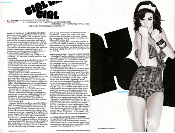
In this double page spread Katy Perry is the main image, mise-en-scene is used as the whole theme of it is black and white making it look original, simple and vintage.  Having it in black and white also makes it look professional as so does the columns makes it look professional also.The clothes that she is wearing relates to this as well as they are vintage and appeals to the audience. The lighting in the image is very bright enhancing the star. The main star is very big and takes up half the page showing how important she is.

The main title is bubbly and round which suggests that it may appeal to females more than males as it would be more bold if it was. The darkness of the colour contrasts with the white background making it stand out more. It emphasises it and makes it stand out so you know that it is the main title.  Straight away in the sub heading you know who it is about with Katy Perry in bold, using the word 'Hot pants' links with the image as that is what she is wearing.

I would like to do something like this in my magazine as she does relate to the genre i want to do which is pop and is quite girly. I like the colours used as they are professional and make it look better. Its makes the star look more important and the way she is standing looking at the camera shows the direct address that she wants between the audience and her making you feel like you have an insight to her life.

Preliminary task


This is my school magazine that i had to create, I had to create the cover page and contents page as my preliminary task. 

As i did some questionnaires on school magazines and what people would like to see in them, the colours on them and information i took that in and tried to make a magazine that would suit what most people said. I used a medium close up image for my main cover star with him looking at the camera creating direct address with the reader. It suits the main cover line as the way he is standing shows he has a good structure which the head boy would have so they link together.

Most of my questionnaire people said they would like to see achievements which is why i included it in my front cover as a cover story to attract the reader to go inside. Including the achievements also big the school up making the school look better and showing off what we can do.

Showing on the front cover clearly that prom photos are inside shows the audience that it is just not going to be loads of writing but also some pictures as well to even the magazine out and make it appeal to more audiences as most people said they would want to see loads of pictures. If we included pictures younger years would also want to see the magazine as they would not just have to read it.

Based on what i have learnt about magazines putting 'Win an Ipad' in a star drags the readers attention as its such an easy win for you and a big prize. If i didn't put this on the front people wouldnt know and therefore wouldnt enter or may not even read the magazine. If people are eager to enter the competition i have put it on the 7th page of my magazine so if they did they would have to flick through all of the pages so they would end up reading it and not letting the magazine o to waste and just putting it in the bin.

The font writing all links together as all of it is the same and it would run through my magazine making it look more professional. I also have made it look professional by using a colour theme, using the colours white black and red link with the school logo and uniform making it look apart of the school and not some random magazine. This preliminary task has made me improve on my skills of making a magazine cover and will help me for my final one.

Monday, 21 October 2013

Target Audience magazine

Target Audience
I want my magazine to be popular so therefore I want my music to be pop style, like the big top 40.This appeals to loads of people as the people in the Big Top 40 have very popular fan base. The way I want my music to be pop/rock would attract both boys and girls unlike something like rap music. Examples of people that do pop rock are Miley Cyrus and Selena Gomez. There look interests me and many other people and this is why I would like to use it. So my target audience is quite big.

Research

I have decided that with my cover star I don't want to do a band instead I would like to do just one girl. I like the look of this photo and I also like the music genre which is pop/indie. This photo on the front of my magazine would be good because it would appeal to my target audience and age range. It also shows direct address to the reader. It inspires me in my magazine and I like the pose and photography of it and would like to experiment with my model and do things like this. It makes me know who her audience is then as I did some research on her which is young adults. I would want the person for my magazine to be young so this is a good thing as it would get me that audience.