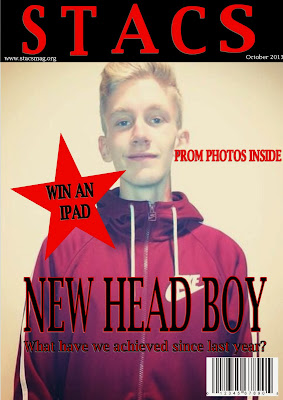
This is my school magazine that i had to create, I had to create the cover page and contents page as my preliminary task.
As i did some questionnaires on school magazines and what people would like to see in them, the colours on them and information i took that in and tried to make a magazine that would suit what most people said. I used a medium close up image for my main cover star with him looking at the camera creating direct address with the reader. It suits the main cover line as the way he is standing shows he has a good structure which the head boy would have so they link together.
Most of my questionnaire people said they would like to see achievements which is why i included it in my front cover as a cover story to attract the reader to go inside. Including the achievements also big the school up making the school look better and showing off what we can do.
Showing on the front cover clearly that prom photos are inside shows the audience that it is just not going to be loads of writing but also some pictures as well to even the magazine out and make it appeal to more audiences as most people said they would want to see loads of pictures. If we included pictures younger years would also want to see the magazine as they would not just have to read it.
Based on what i have learnt about magazines putting 'Win an Ipad' in a star drags the readers attention as its such an easy win for you and a big prize. If i didn't put this on the front people wouldnt know and therefore wouldnt enter or may not even read the magazine. If people are eager to enter the competition i have put it on the 7th page of my magazine so if they did they would have to flick through all of the pages so they would end up reading it and not letting the magazine o to waste and just putting it in the bin.
The font writing all links together as all of it is the same and it would run through my magazine making it look more professional. I also have made it look professional by using a colour theme, using the colours white black and red link with the school logo and uniform making it look apart of the school and not some random magazine. This preliminary task has made me improve on my skills of making a magazine cover and will help me for my final one.


No comments:
Post a Comment